
Ok so let’s start:
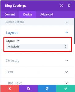
Step 1: Open Blog Settings > Design Tab > Layout > Select Fullwidth
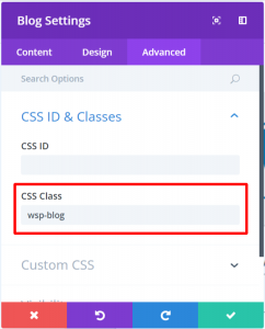
Step 2: Go to the Advanced Tab > CSS Class > Define a custom CSS class, let’s say wsp-blog
Step 3: Go to Divi > Theme Options > Custom CSS and add the following CSS Code:
@media only screen and (min-width: 1080px) {
    .wsp-blog .et_pb_post.has-post-thumbnail .entry-featured-image-url {
        float: left;
        width: 30%;
        margin-right: 4%;
    }
    .wsp-blog .et_pb_post.has-post-thumbnail:not(.format-gallery) > .post-content {
        padding-left: 34%;
    }
}
The end result will look like the below image: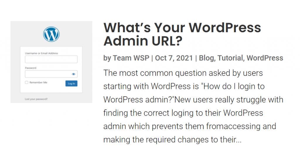
CSS Explanation
Using the above code, the feature image’s width is set to 30% and the margin between the featured image and content is set to 4% which makes it a total of 34% space being utilized. Hence, we need to give the post content a padding-left of 34%. You can increase or decrease the space featured image takes up or the space between the image and the content by playing the width and margin and update your CSS code accordingly.
Hope this article helped you in styling your Fullwidth Divi Blog module!!